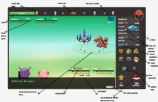
Arkant0s96 said:
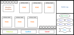
The battle starts on this screen:
https://i.gyazo.com/dc361aeba0fb1061b02f52bb939c7b14.png
You can already see what happens when clicking bag (battle chat changes to bag resulting into similar to what we have now)
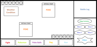
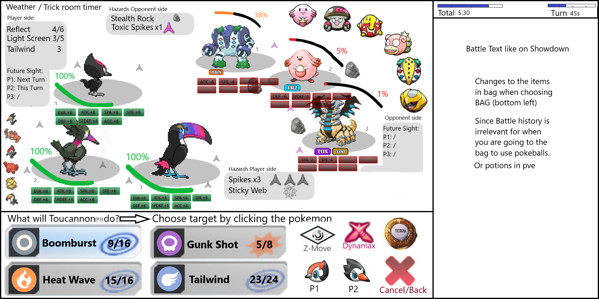
If you click Move Button, screen turns into:
https://i.gyazo.com/c5fceb273c175d54a44d0a04f25436d2.png
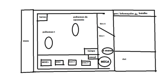
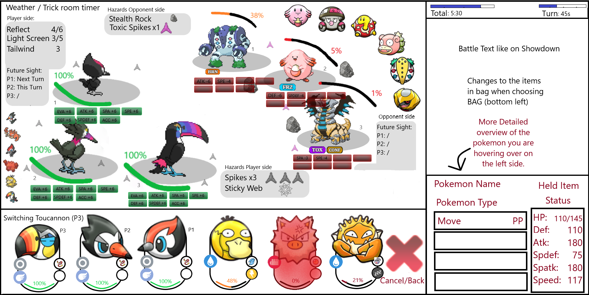
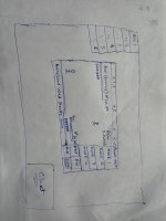
If you pick switch button (switching to other pokemon from team):
https://i.gyazo.com/ee52c862bb49055dd9bec73e1b49c05e.png
If I end up having the time, I'll remake it with some added in icons & pokemon already. Kind of feels messy cuz of the amount of explanation i did on the pictures.
EDIT: Apparently the BB code isn't working & dont see a way to add attachments like the previous entries have :S
Sadly didnt have the time to touch up the abstract images above used more:
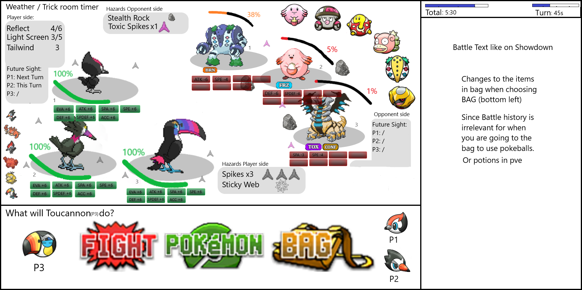
- Start of turn (triples) battle:
Mainly note the full team preview on the battlescreen rather than in text.
Tried working with an elliptic format with a 'diagonal' line separating player & opponent side. Adding a bit more dynamic rather than just having straight lines on the battle screen.
Overlapping issues can easily be fixed by making the chat screen a bit slimmer, but didnt have the time to adjust once i noticed the stat stage overlap.
Numbering the slots the pokemon stand on was needed for me to be on screen aswell, to make sure all goes as you plan (and you don't accidentally switch in a pokemon on the wrong pokemon slot or smth)
The lack of background is because I honestly love our current backgrounds we have, so I preferred to have this rework mainly to be about User Interface, rather than Art.
Bottom part of screen showing which pokemon you are currently deciding what to do, clicking the other pokemon (pikipek & trumbeak in the picture) will switch to what that pokemon (or pokemon slot) should do.
I decided to remove Run on this example, because I assumed wild spawns would never be 3v3 format & thus the icons of the other pokemon slots can be changed into our current run icon.
These pictures were made before the forfeit suggestion came up in discord & I'm gonna be honest, never crossed my mind until then to add it here. However, does make sense to me to have the forfeit button on the bottom right (under the battle text).
Choosing bag (as typed on the picture) would change the battle text into our inventory. Didnt really see any fault in our current inventory system & it only being pve usable, i just ignored to add this in picture
")
.
Hovering over the opponent's team preview will show their remaining hp %, their status conditions (if any) & used moves (ngl used moves also only occurred to me to add after suggested by others before me), aswell as their names, types & possible abilities [the full stat range can be added aswell, but dont rly want to bomb it with too many numbers].
Wanted to add a small picture of this hover overscreen aswel but again, didnt have the time/feel for it past couple weeks, this would show up bottom right (same position it will in next picture for your own pokemon after choosing switch).
As you can see, this shows your entire team, their typing, their held item, their hp left & their status. When hovering over one of them, detailed info appears on right side (hover can be adjusted to be 1 click & only actually selecting a pokemon to switch would require 2 clicks, this to help mobile users, hover is a pain on my mobile

).
Primeape is shaded red because that pokemon is already fainted. Also why its shaded red on the left side of the battle screen.
Not gonna lie, im most proud of my switch UI

.
Not really sure what needs further explaining than what's shown on screen (the weird icon next to dynamax is terrastallize, ai art couldn't make anything better than that but again, i mainly wanted to focus on the user interface, not as much on the actual art of it)
Z-move icon would change into Mega icon when applicable. Both can be on same spot because both require you to hold a specific item (z-items or mega stones).
'*Arrow* Choose target by clicking opponent pokemon' wouldnt actually show in the screen permanently (a choose target prompt can be made like how you get a prompt [already implemented in-game] on what pokemon from team you want to use item on while not in battle)
Optional extra detailed information of the move you clicked once/hover over (again i prefer clicking twice to actually pick a move for mobile players) can be added on the bottom right part again.
Am a bit bummed myself I couldn't fully finish it the way I wanted to (let alone add doubles & singles format pictures). But still happy enough to submit it
.
TLDR:
- Elliptic battle screen with diagonal player-opponent split => more dynamic than straight lines
- Numbered pokemon slots
- Team preview in battle screen
- Overlap issues can be fixed by making battle text a bit slimmer
- Pokemon summaries on Switching
- Focused mainly on the UI side, not on the Art/colouring side
Hope everyone had fun thinking of a UI overhaul.
PS: i'm sorry all dark mode users, didnt realize the pictures would show this huge here